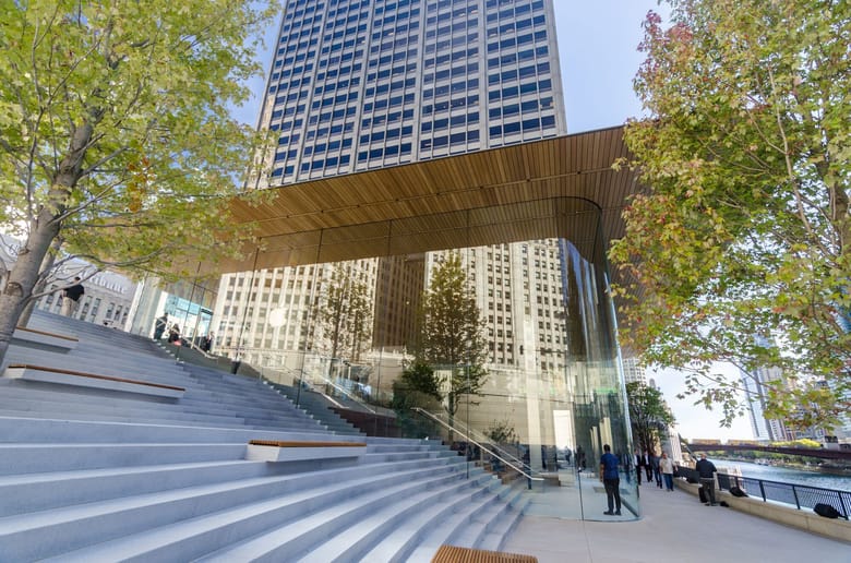
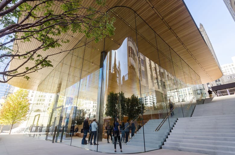
Apple Michigan Avenue is the first of a new generation of store designs that the company plans to replicate at its most significant retail locations. The plot of land the Chicago store stands on is unique because of its historic significance. It was here that Jean Baptiste Point du Sable, the city’s first permanent non-native settler, lived. Across the Chicago River, the U.S. Army set up Fort Dearborn in 1803. Today, the intersection is one of the most visited, with iconic views in every direction.
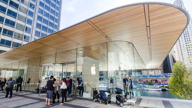
In choosing the site, Apple knew it had some work to do. Pioneer Court was barren and blocked the view of the river. A restaurant on the riverbank sat below, but without direct access to the plaza, it suffered. Foster + Partners’ design gives the corner a new life, with easy access between the river and the plaza. The store takes up less than 50 percent of the site, and the retail space takes up less than 50 percent of the interior. Every design feature minimizes the boundaries between the interior and exterior, including the ultra-thin roof and 32-foot glass walls. The transparency is heightened with radius corners of glass that visually disappear, allowing viewers to more easily notice the river below. The architects also tapered the metallic-colored roof’s edges so it visually rests more lightly on top of the glass walls.
COMMUNITY GATHERING PLACE
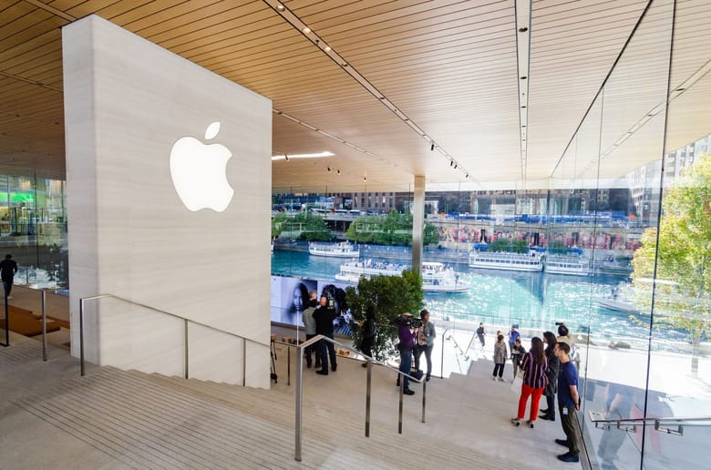
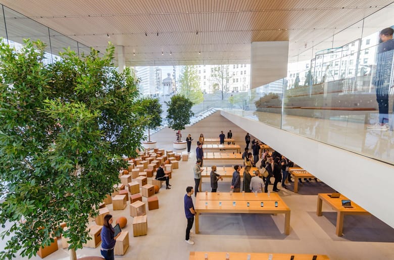
Inside, Foster + Partners responded to Apple’s wish to have the store be a community gathering place as much as it offers a retail presence. The firm designed multiple cascading staircases with landings inside and outside the multi-story space. These staircases function as a “town hall,” where people can linger and exchange ideas. Apple hopes the cross pollination of ideas will occur more easily with this new open design, than it did with the closed-off dual levels in older store designs. Additionally, the architects accommodated Apple’s goal for the store be a learning hub by placing an experiential and educational area called The Forum at the foot of the interior staircases. The space offers a clear view of the river and the retail section of the store, along with plenty of seating.
MODERN DESIGN
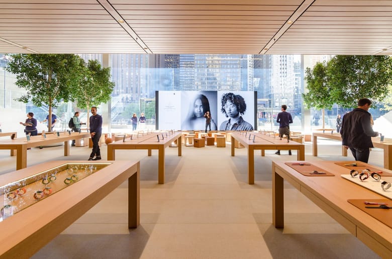
The architects used a wealth of subtle materials and details that quietly stay out of the limelight, leaving the spectacular staircases and river view to draw people down to The Forum. For example, the architects chose Castagna limestone from Bari, Italy for the walls and other vertical surfaces because it deceptively hides gentle veins of color within its calm, creamy look. To up the tempo a bit, the architects designed the floors with Chinese granite tiles, which have a uniform, slightly speckled look. An array of wooden tables, chairs and stools warmly augments the slatted ceilings of stained American white oak, which contain nearly invisible perforations to absorb sound. The flat panels of glass so important to the multistory river views were made by Sedak, a German glass manufacturer. These large areas of transparency break down the barrier of the building, focusing attention inside while also letting the interior bleed into the urban environment outside.
Did you know?
While some believe the pavilion’s roof is a subtle rendition of a MacBook’s lid, the architect says it’s a coincidental result of using Apple’s product design principles to remove boundaries on the building so we focus on the Chicago River and the products.
Did you know?
In an effort to be a gathering place, Apple Michigan Avenue is hosting year-round “Today at Apple” sessions that invite customers into the store to learn new skills run by local professionals.
Did you know?
Apple’s first flagship store was located in Chicago. It opened in 2003 a few blocks north of the current location.
