Harold Washington Library
When it comes to Chicago’s iconic skyline, it isn’t always easy to make a mark and stand out from the crowd. But that isn’t something the Harold Washington Library has struggled to do.
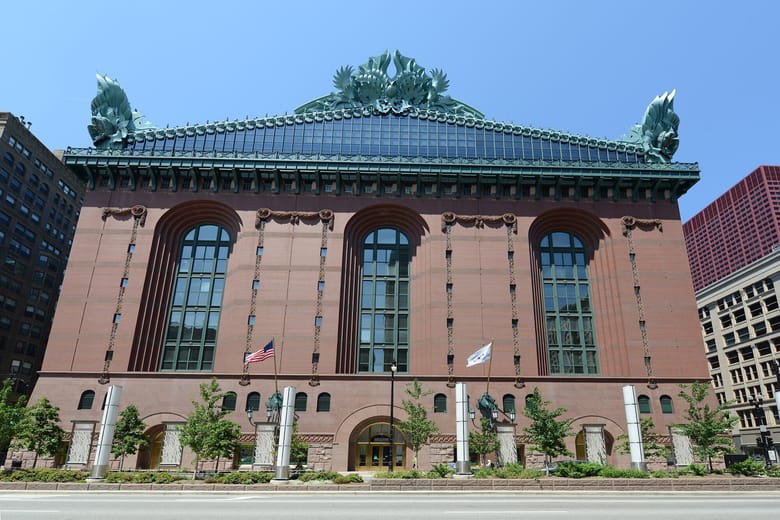
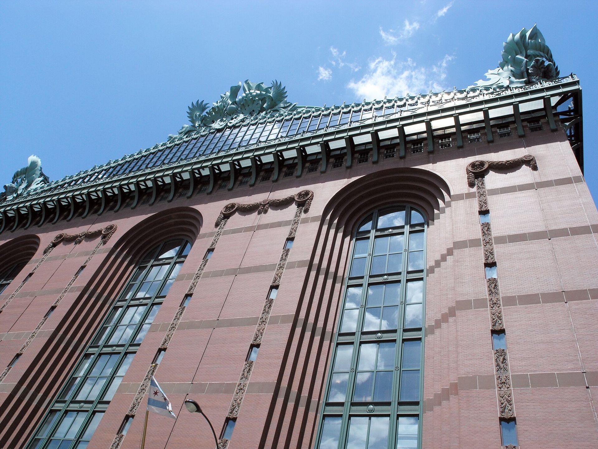
The building’s massive footprint and abundant exaggerated ornamentation practically scream, “Look at me!” All of that ornamentation does more than just decorate the structure’s exterior, though. The Harold Washington Library wants our attention for a practical purpose too. Boldly Postmodern, it wants to tell a story. The building playfully displays dozens of symbols that communicate its function, celebrate its location and pay homage to its architectural predecessors. Some might say you can read it like a book.
DECODING THE SYMBOLIC ORNAMENTATION OF HAROLD WASHINGTON LIBRARY
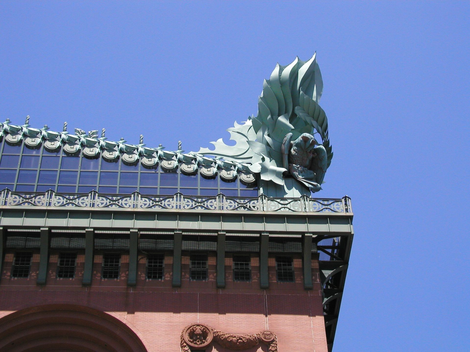
The Harold Washington Library's collection of ornamentation is purposeful and productive. If you look a little closer and dig a little deeper, it will tell you exactly what it is and the reason for its location. For example, enormous owls, which serve as oversize acroteria, perch at each corner of the building's pediment and above its main State Street entrance. The owls represent wisdom and serve as clever advertisement for the 70 miles of bookshelves living inside.
A LIBRARY THAT LOOKS LIKE A LIBRARY
In 1987, a design competition was announced in Chicago. The winning team would create a replacement for the old central library—now the Cultural Center. The competition was highly publicized and somewhat controversial. Critics complained that the competition’s design and build format required entrants to be firms who would manage all aspects of design and construction. But the city hoped this format would keep construction of the new project on time and on budget.
Five finalists were chosen, the public weighed in and the jury deliberated. Ultimately, the SEBUS Group, led by architect Thomas Beeby of Hammond, Beeby, & Babka, took home the jury’s prize. While the other four designs resembled corporate office buildings of the 1980s, Hammond, Beeby, & Babka's stood apart. Jury Chairman Norman Ross said, “This is a building you can trust. … This looks like a library. This is it.”
TRANSFORMING THE SOUTH LOOP FROM VICE TO NICE
The library’s completion marked the beginning of a transformation for the South Loop. During years prior, south State Street was riddled with vice. But today, it’s a thriving residential community and several universities maintain a presence there. Tens of thousands of students attend branches of Columbia College, DePaul University, Roosevelt University and Robert Morris College.
Did you know?
The 10-story Harold Washington Library appears to have masonry load-bearing walls, however it is actually constructed on a reinforced concrete frame through the eighth floor with a steel frame on its uppermost floors.
Did you know?
The Harold Washington Library was named after Chicago’s first African-American mayor who held office and served the city from April 29, 1983, to November 25, 1987.
Did you know?
The Harold Washington Library contains the remnants of the book collection donated by England's Queen Victoria following the Great Chicago Fire of 1871.


