Monadnock Building
As you pass by the Monadnock Building in Chicago’s Loop, you may not recognize it as a transitional moment in architectural history.
Official Name | Monadnock Building |
Address | 53 W. Jackson Blvd. |
Architect | |
Style | |
Neighborhood | Loop |
Current Use Type | |
Original Completion Date | 1891; 1893 |
But in this building, the shift can be seen from load-bearing construction to skeleton frame construction. It represents a broad change happening throughout the city during this time.
ONE BUILDING WITH TWO FACADES
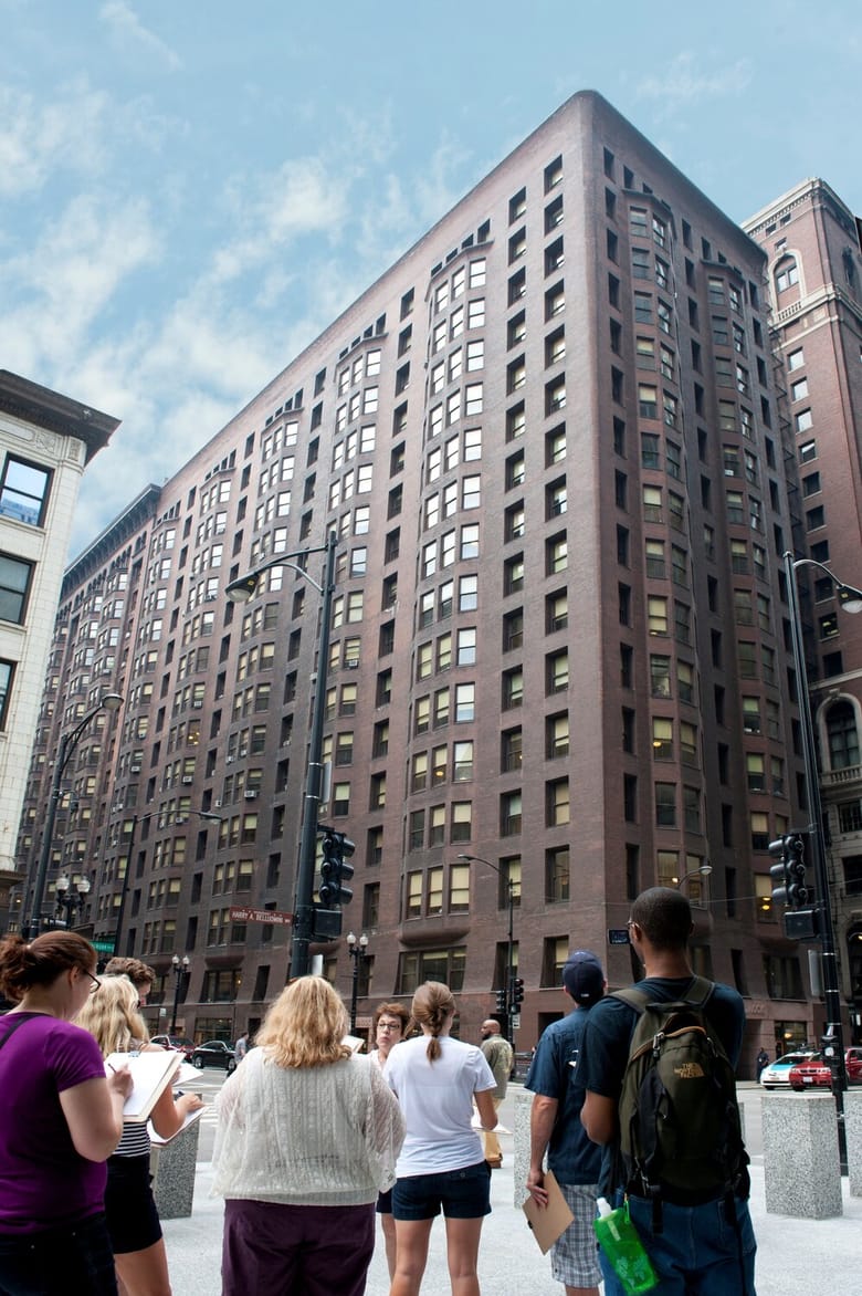
Built in two phases, the Monadnock Building functions as one large structure. However, the facades of each phase couldn’t look more different. The Monadnock’s northern half wears a daring, stripped-down facade, while its southern half is adorned in traditionally inspired ornamentation that expresses its metal structure. Each half, in its own way, demonstrates the transition happening during its time.
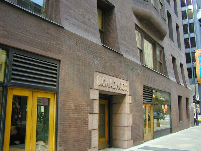
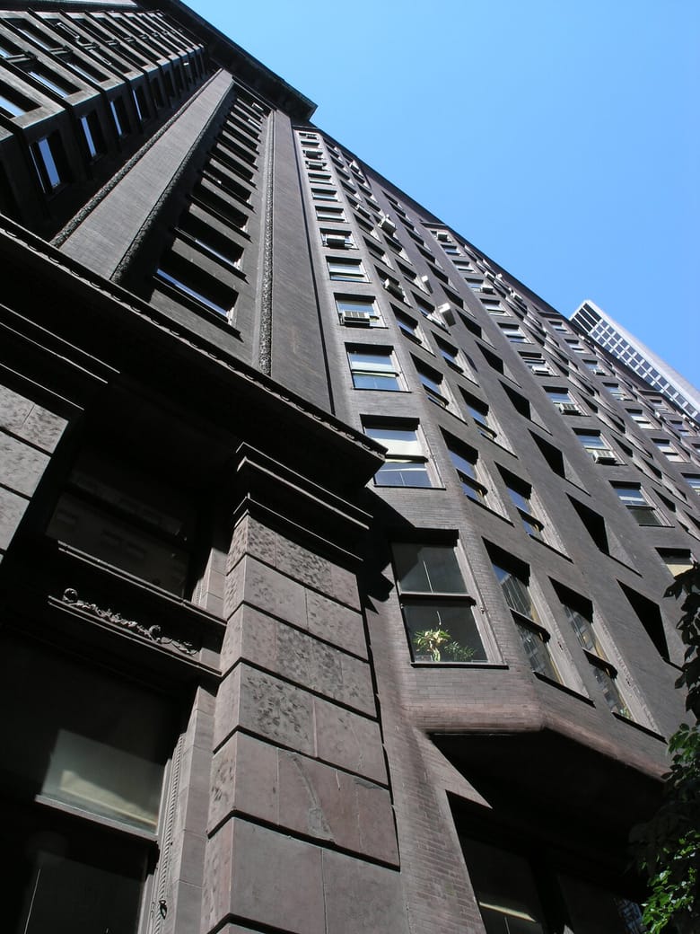
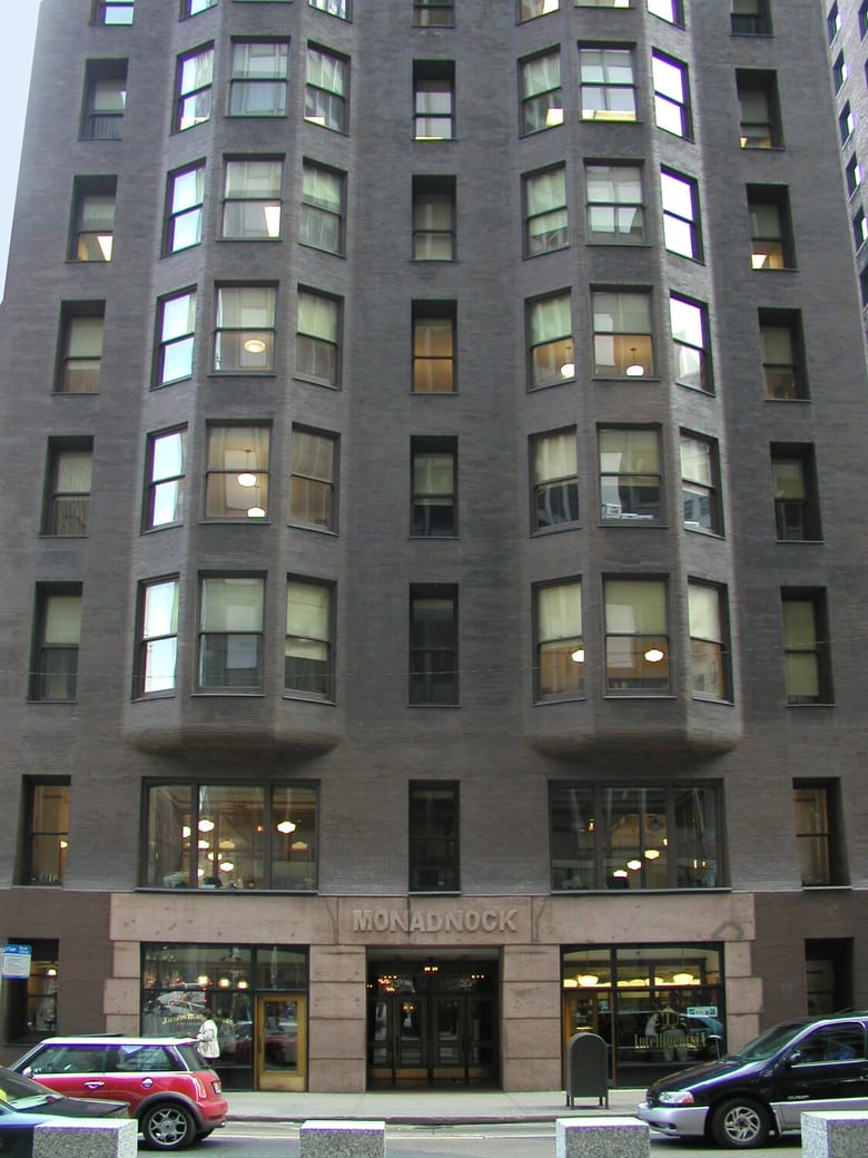
The northern half, completed in 1891 and designed by Burnham & Root, has exterior walls that layer brick on top of brick, in the load-bearing tradition. But its construction also reveals technical advances being tested at the time. The building’s undulating bay windows are supported by cantilevered steel. The visibly thick brick walls—six-feet-thick at the corners—may support the building's weight at the perimeters, but are aided elsewhere by a hidden steel framework.
Though the battered base and projecting bays are reminiscent of bell-shaped papyrus columns used in ancient Egyptian temples, the building's lack of ornamentation bucked trends of the time and hinted at the stripped-down facades that would become popular decades later. In 1892, Louis Sullivan wrote in “Ornament in Architecture,” “I take it as self-evident that a building, quite devoid of ornament, may convey a noble and dignified sentiment by virtue of mass and proportion.” Many believe he was referencing the recently completed Monadnock. It's clear that the building’s design made quite an impression on the architecture community of the time.
When the second half of the building was designed by Holabird & Roche just two years later, experimentation and transition could be seen in its structural systems. The brick and terra cotta facade of the southern portion need not bear the weight of the building. Instead, it is hung on a rigid metal frame that transfers loads to the ground.
Did you know?
The building once had four 100-foot sections designed to be operated as four separate buildings. Each had its own entrance and was named after one of four mountains in New England: Monadnock, Kearsage, Katahdin and Wachusett.
Did you know?
Because of the building's narrow lot, all the vertical circulation—elevators and open staircase—is tucked in the middle of the building with skylights letting in light from above.
Did you know?
Root's early designs for the north half of the building called for a radically different design than what was eventually built. He and developer Owen Aldis considered a building that included steel columns, girders and beams with laterally trussed floors.
Did you know?
The restoration that began in 1982 was meticulous. One example of the attention to detail is the marble used in the lobby’s hand-carved trim. It comes from the same quarry in Italy where Root got his original supply.
Did you know?
Ludwig Mies van der Rohe was enamored with the Monadnock Building and made many sketches of it when he first arrived in Chicago.

