McCormick Tribune Campus Center
A bold contemporary student center, surrounded by icons of Mid-Century Modernism, unites a Southside campus.
Photo by Eric Allix Rogers
Photo by Eric Allix Rogers
Photo by Eric Allix Rogers
Photo by Eric Allix Rogers
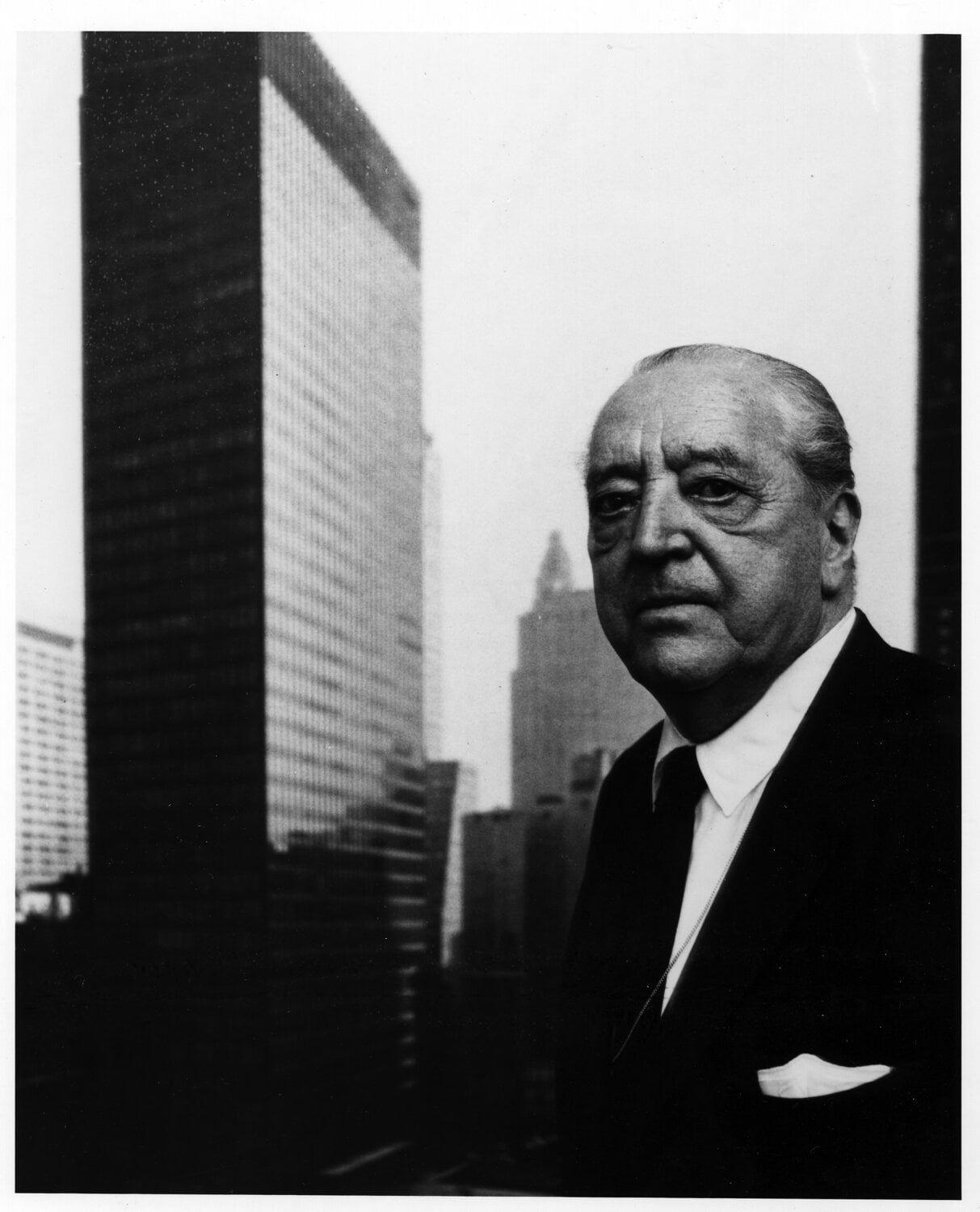
In the middle of the greatest concentration of Ludwig Mies van der Rohe’s International Style buildings in Chicago you will find the McCormick Tribune Campus Center, designed by Rem Koolhaas of the Office for Metropolitan Architecture (OMA). Built on the Illinois Institute of Technology (IIT) campus, the Campus Center stands in sharp contrast with the designs of Mies, while honoring his legacy at the same time.
Prior to the construction of the Campus Center, only two buildings had been added to the IIT campus since the 1960s. The campus was declining, both in prestige and in the number of enrolled students.
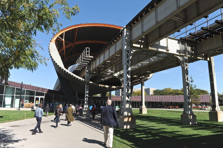
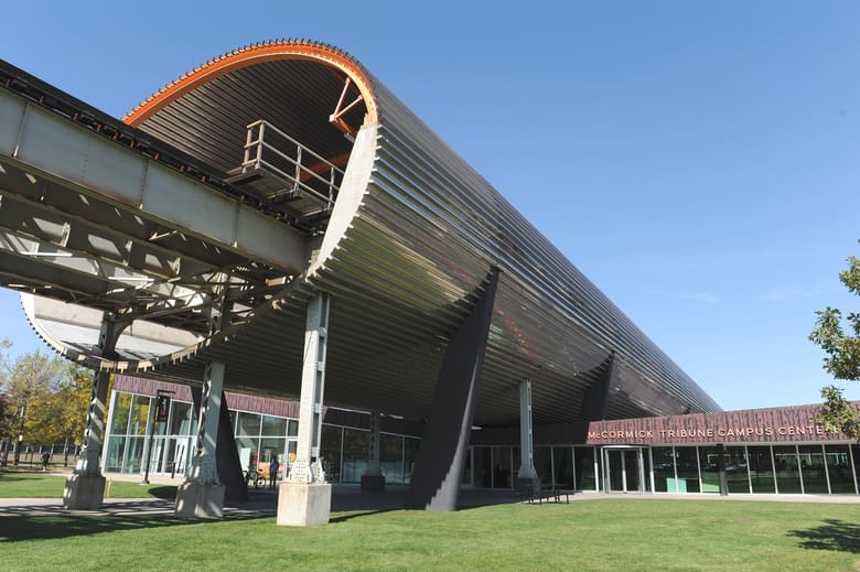
The L, Chicago’s elevated train line, divides the campus both physically and psychologically by separating the residential area from the academic buildings. In an attempt to rejuvenate the school and join the two parts of the campus, an international competition was held in 1998 to build a campus center on the plot of land below the L. The winning entry by OMA opened in 2003 and is a hub for student life on campus. It is the first U.S. building designed by Koolhaas.
A VIOLIN CRUSHED BY A TUBE?
The shape of the Campus Center is sometimes described jokingly by the students as a violin crushed along its center by a tube above. The tube, an elliptical stainless steel encasement around the L, acts as a shield to muffle the noise of the train.
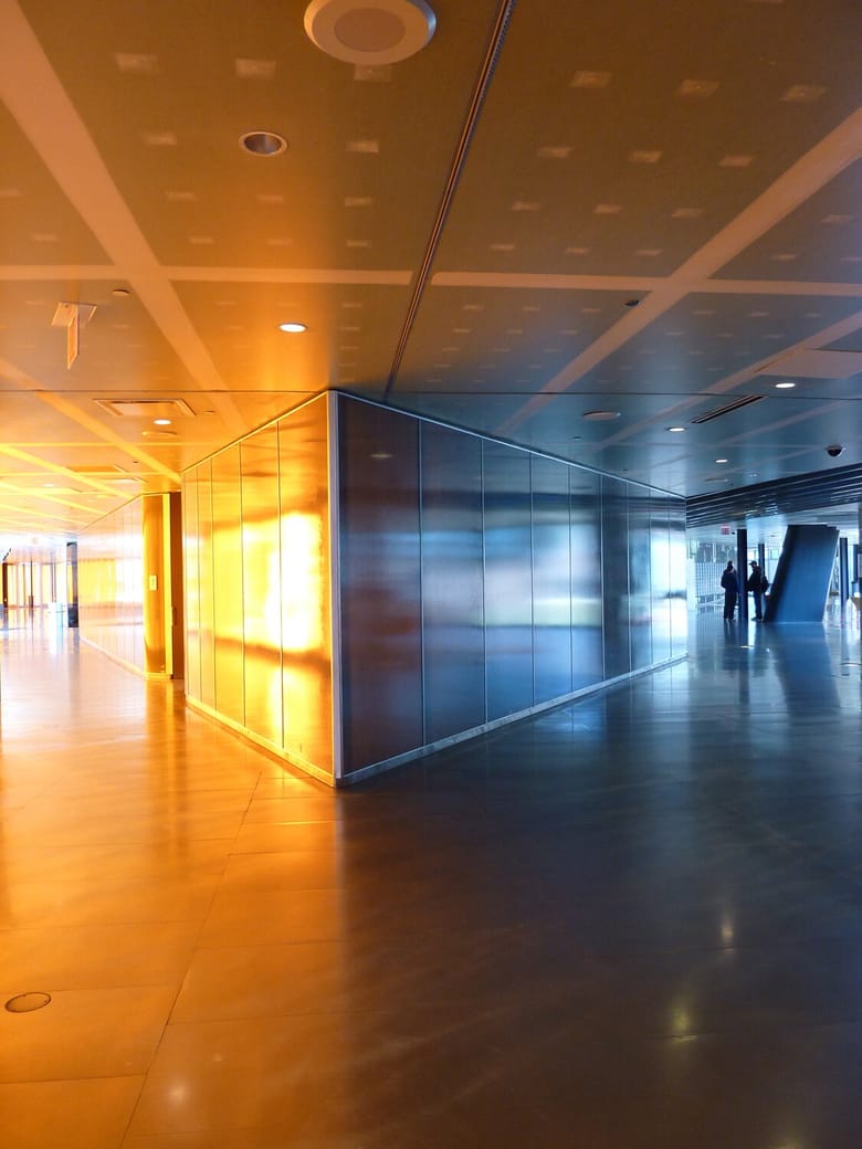
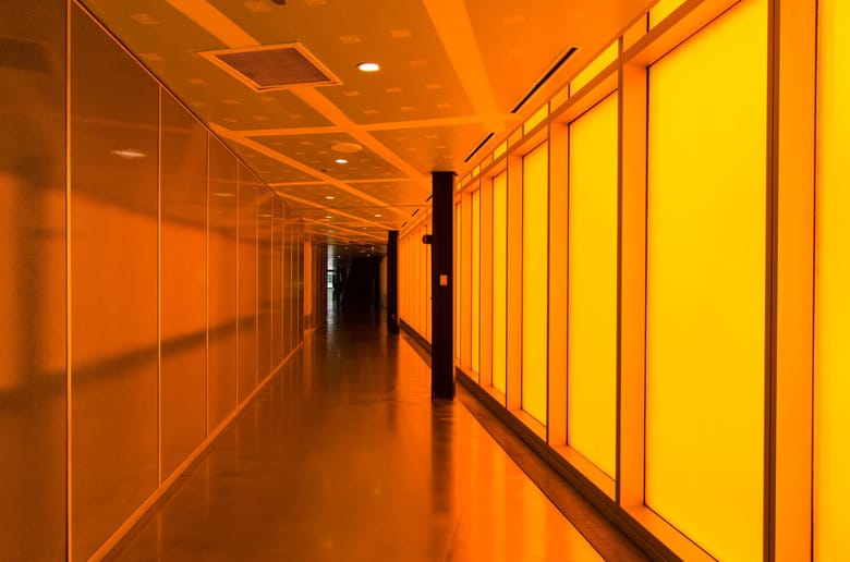
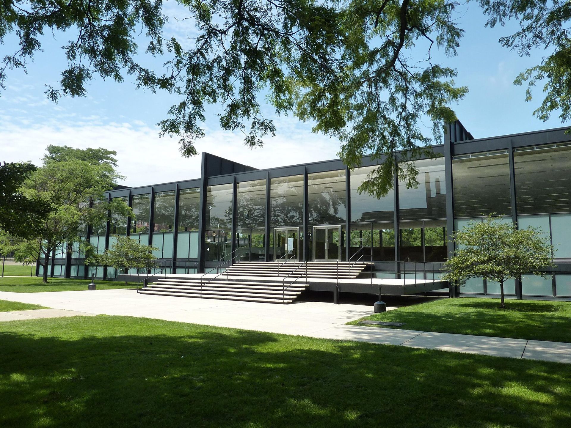
The one-story building below is an explosion of color and material. Its bold exterior is Koolhaas’ unmistakable response to Mies’ austere Crown Hall, which lies a block south of the Campus Center. Inside, a mosaic of bold colors designates the building’s separate functions.
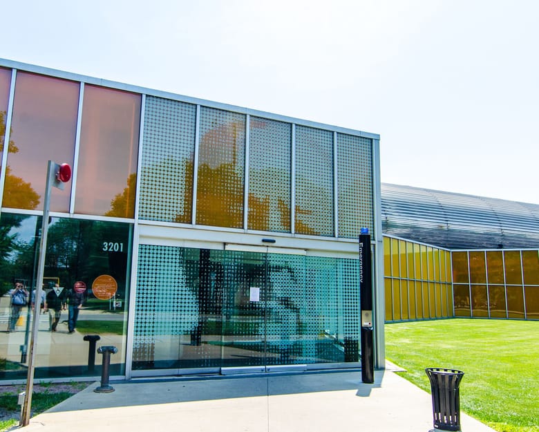
Iconography also plays a big part in Koolhaas’ design. He hired New York graphic designer Michael Rock to create two-and-a-half-inch-round icons that indicate student activities and denote specific functional areas. These icons are a unifying element throughout the building and make up large graphic images, like pixels in a dot matrix. One image is an 18-foot-high portrait of Mies on the west facade doors.
PRESERVING THE COMMONS
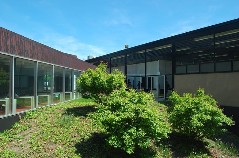
The Campus Center sits next door to the historic Commons Building, which was built in 1953 and designed by Gene Summers, an architect in Mies’ office. Koolhaas’ original design imagined the incorporation of the building into the Campus Center. He intended to turn two of the Commons’ exterior walls into interior walls within the Campus Center. Preservationists were outraged at this proposal and asked that at least 12 feet separate the two buildings. The final design is a compromise between the two proposals. The clear glass eastern facade of the Campus Center physically connects, while visually separating, the two buildings.
Did you know?
Koolhaas employed a team of students to track movement across the McCormick Tribune Campus Center project site and turned the map of heavily traveled paths into the walkways through the building.
Did you know?
The roar of the trains without the tube hits a jarring 110 decibels.
Did you know?
Koolhaas had to make many design compromises to avoid cost overages in the McCormick Tribune Campus Center. For example, areas of the ceiling are unpainted drywall with only plaster covering the joints and screw holes.

